Showing posts with label design. Show all posts

11.12.10

the future

a few weeks ago, i popped over to london to take care of a few things: there were a series of excellent exhibitions on that i didn't want to miss (i'll write about them later); there were some friends i needed to touch base with; and there was a little symposium about the future to attend.

thrilling wonder stories, part II was organised by geoff from bldgblog and liam from tomorrows thoughts today at the architecture association in london.* and featured a stack of writers, gamers, interactive designers, artists and researchers talking about a whole range of fiction-based ideas about the future and its possible construct.

check out the list of amazing people involved!

oh, and did i mention it was free? charlie and i were there at 10:30am, expecting a marauding mass of architects falling over themselves to be part of the discussion. turns out architects aren't quite like that.


i don't really consider myself much of a futurist - sometimes i'm disappointed when discover that i'm actually too romantic to readily cast aside old ways of behaving in favour of new innovations. but i'm  really attached to the idea of innovating and changing and mixing it all up so that we don't get caught up in our stinking thinking.

and unlike my dear friend rob who thinks that kind of talk is bollocks, i do actually believe in the idea (one i think i've garnered from bldgblog or russell davies or some other awesome brain) that in aiming way forward to gain 10, with the inherent 'backdraft' of life, you can still actually gain 3.

science fiction (inc some of its design associates like buckminster fuller and pentagram), is an excellent tool for designing for the future in this way. if you get wacky and can really design for 'a galaxy far, far away' you might just unlock something that will be functional for a building that will be great for 10 years' time.

or, free from the constraints of 'must be viable', you can end up with 'could be possible' and you start to solve problems that no one has bothered to think about yet, whilst still make them believable to an audience firmly sitting in the present day. language, imagination and concept rooted in fact. ftw.


so, the day was split into 5 sessions (perhaps a little OTT, by the end of it all), but each session started to unpick different aspects of designing for the future.

i didn't really make very objective, journalist notes like rory did, so my report of the day is going to be quite subjective and perhaps influenced by where the ideas took me, rather than what was actually said.  (if that isn't a caveat for sloppy reporting, misquoting and laziness, i don't know what is!)

the ideas which floated my particular boat i'm calling designing for hiding, the smell of the moon, and using changed behaviour through gaming.

designing for hiding
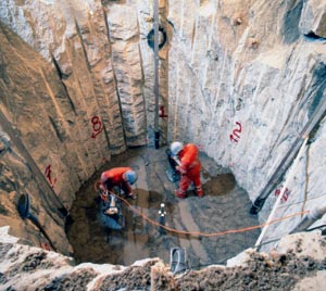

geoff manaugh spoke about geologists dealing with nuclear waste having to come up with a protocol to signify to future generations: DO NOT OPEN THE CAN!!. basically, there's a stack of toxic waste being drilled into the earth, which is all fine and dandy for us who can read a sign or two, or who have the means to be in communication with the culprits. but how do you build a vault to hide that garbage, with those 60,000 years in the future in mind. given that we've no concrete idea about what stonehenge, the pyramids or macchu pichu are trying to tell us - how can we expect the equivalent to understand what our 'wrong way go back' signs might mean.

not only did this particular feat of language and signification pique my interest, but the whole idea of designing for the hidden was exciting too.

everyone knows that if you want to hide something, put it in plain sight. the real outcome of a tunnel, maze or complex series of encryptions is not safekeeping, but a means of revelation, discovery and inquisition. the safe is the best kind of learning tool. it got me thinking of other ways to use this kind of design process. maybe the best way to teach young boys to read is to bury books in a well, or the hide ideas about sound behind a glass soundproof door.

the smell of the moon


now, when i told this story to my scientific photographer friend, of course i didn't have all the facts and he picked holes in it straight away (spoil sport), but the idea and the possibility of what this means still totally floated my boat.

nicola twilley presented a story about perception from the moon - astronauts on one of the apollo missions recalled the particular smell of the moon - that it was something like gunpowder. they brought back a sealed sample of the moon dust and no aspect of its chemical added up to smell anything like gunpowder. which means that the way humans smell on the moon is different to the way we smell on earth.

which of course calls into question our whole perception of life itself, but also about the possibilities for the actual science of earth and/or the moon itself. if we perceive things differently away from earth, whose to say that things aren't actually different here. and if the chemical properties are different away from the moon, whose to say that what we believe is on the moon is not completely different. like, what if we only see a desert of sand and dust and fuck-all, but

now all of this is fascinating from a philosophical point of view, but the reason i think this kind of 'what if' thinking is important is for other areas of existence. like the perception of power, or the perception of life itself (like the couldabeen arsenic-ingesting bacteria from last week).

which leads me onto...

changed behaviour through gaming


ed stern spoke about the splash damage game brink, which was an intense FPS multi-player, multi-level game with some amazing architectural and wayfinding structure inbuilt. he spoke about the need to really make things work - "a barrel needs to big enough to really hide behind and small enough to jump over". each level had varying levels of decay - this being based in a future in which war is being waged. the imagery was brilliant and the architectural possibilities for archiving and spatial experience were super exciting.

when talking about designing the next version of the game, ed said that "it would have more women in it" -  highlighting the fact that v1.0 was all blokes**. which had me thinking about a game solely designed on feminist or gender equality principles - it could be a completely different world: social organisation could be different, motives and spatial organisation could be altered -  imagine what that could actually look like!

and what would the kids who played that game grow up to be like, if they had already experienced a world in which women and men really were treated equal? what if gaming is used to construct alternative social dynamics in which we experience an altered perception, reinforced by haptic and sensorial memory. i mean could we equalise men and women? could the israel/palestine conflict be solved through gaming?

epic win.


UPDATE: so it turns out jane mcgonigal has presented some similar ideas, and join the company and method are also doing work on the small ways in which you can use play/gaming for changing behaviour.


*here's the chain of promotion: @roryhyde;@sheseesred;@CharlieGower + @johndodds (who watched it live on the interwebs). who sez we're disconnected, yo.


** although the lead character, i noticed, was an afro-carribean man - something i haven't really seen in macho gaming this far. not that i'm a gamer, per se - i have zero dexterity.

29.7.10

love game

game controller soaps!!


awe.some.

if i was here for christmas, i would be sprinting to third drawer down (where these pics are from) and half my friends would be receiving them as presents.

in the mean time i'll be hoping they release playstation and old school nintendo ones too.

12.6.10

un 4.1

un 4.1.
rhymes nice.

so, next wednesday, 16th june, is the launch of un magazine's latest issue. which includes a piece of mine, so you should all come down to the grace darling and get your hands on a copy. and support the magazine, and watch the bands and have a nice drink or something to eat at the fine establishment it is.

here is the beautiful invitation/poster, designed by melbourne's designer du jour brad haylock.


see you there.

10.6.10

what your email address says about your computer skills

even if this awesome little thing from oatmeal is bogus, i'm still feelin' a bit smug.

especially because it validates my judgemental attitudes.
what else, after all, is blogging for? :D

18.4.10

sew: supporting and empowering women


i like pretty things.

i like pretty things even more when they are produced upon sound principles.

these are ace bags, made by tanzanian HIV+ women, who are paid fairly and the profits going back into the project, which destigmatises these women and their disease.

and, as a beautiful match, i also love readings book store in carlton (actually it's an evil place where i spend far too much time and money. but i digress), which is where these bags are for sale.


thanks to the design files, via angus

3.3.10

i am not my swedish furniture

thanks to my creative catalyst pal, stan, i've discovered yet another reason why i love the internet:

the dila swedish furniture name generator. i love a good visual meme.


here's me as an item of swedish furniture


what's your name? go here.

23.7.09

today i make a commitment to the future we design together.


initially this was going to be a post about the state of design festival, a project that i planned and one organised by those fabulous ladies over at architecture + philosophy. it was going to be about the future of acoustic spaces, one of choice and the generation which has a commitment to choice.

but instead it's going to be about backing out of a commitment in order to preserve ones integrity. about not designing for the sake of an opportunity, but having the restraint to remain authentic to a level of quality and/or clarity of message.


you're all sick of hearing about my research into sound in the public space, but when i was working towards project for this final semester, i checked out to see what the state of design and their fantastic cultural program were doing, remembering that their theme was 'sampling for the future' - what an awesome partnership: sampling, sound, choice, the future, architecture/design and public space.


i got in contact with the peeps at SoD and it was all very exciting - a last-minute inclusion, but one which could still happen in the 6-week turnaround. sometimes, when the timing is right, everything just flows and you can pull off a project in record time.


this was not one of those times.


as soon as we locked it in, everything just ground to a halt: suppliers were out of stock, samples couldn't be shipped and, more importantly, i just couldn't unlock any money from anywhere and i was fast running out of time to find some. [granted, it's not my field of expertise and i'm sure if it was i would know exactly where to find some, but hey - i is what i is].

i started to be anxious all the time - losing sleep about where i was going to find the money for this, how could i source that from overseas to save time, how could i work the timing around work and i needed to brief the volunteers. the list of things to do kept getting longer and longer. and i wasn't kicking any goals. as each day towards the deadline kept ticking over, the project was getting less and less finished. it was going to be a really crap install, the way this was going.

and, more importantly, i was miserable about it.

i had no faith in the work, i was barely talking about it - i sure as hell wasn't promoting it anywhere until i had a level of satisfaction about it and i was losing any kind of perspective, commitment and aesthetic judgment, fast. i was hemorrhaging.

so, whilst at the ballet with my mum, after barely noticing the first act, i decided that i needed to pull out of the project. i needed to risk disappointing a few, in order to salvage the best parts of the idea. to not present a half-baked design which would benefit, delight or inspire no one. i made a commitment to the future i designed. just not together. and just not right now.

i can't tell you how much lighter i felt. it was instant. and i suddenly had room in my head (and excitement in my heart) for the other projects i was working on. i suddenly had some clarity about works that really did have enough time. and enough money. and i knew that i had reached some kind of milestone - some weird internal rite of passage, where i had said 'no' to a great opportunity, for the sake of my work. it seemed almost old-fashioned (you young whippersnapper, you).

unsurprisingly, i had a whole swag of support for this lack of commitment. LI, NT, DR and GJ were all stellar. and of course my mum was delighted. not just because i paid attention to the second half of the ballet, but nothing worries a mother more than seeing a furrow tattooed into her child's brow.


so, today i make a commitment to the future we design together. by pulling out of projects, in the interest of my own integrity.
and in doing so, i commit to the value of that design and of that future.

13.6.09

yay for chris doyle and his yellow pencil.


i never posted about it here, but a while back, Christopher Doyle's Identity Guidelines flew around email/interweb circles. i fell in love with them (and a little bit with chris in the mean time) and began to tell all and sundry about them.

it is an awesome document, lovingly taking the piss out of corporate identity guidelines and promoting himself as a freelance creative (clearly with excellent skills-to-pay-the-bills).

my personal favourite was always the bit about language/tone of voice and, being the sweary type, would always quote it:


Cynicism and criticism should follow the I think rule. This rule allows me to take ownership of critical statements, lessening any negative impact.

This rule simply involves beginning statements with ‘I…’ Take for example a common, aggressively delivered statement:

“Nickelback are fucking awful.”

When the I think rule is applied this statement now reads,

“I think Nickelback are fucking awful.”

While coarse language is a common element it should be used appropriately (for example, when discussing Nickelback), and never in the presence of Mum_Full Colour Vertical.


If you've never had to work with these kind of guidelines, or needed to develop a document with this kind of 'code', you probably don't find it as awesome as I do. But there are many that do.

Which is why he won a D&AD Yellow Pencil the other night, amongst a whole swag of brilliant designers and creative types. W00t!!


Chris Doyle

congratulations mr doyle.

download the guidelines here

image credit: chris at the awards by ben terrett.
christopher doyle™, identity guidelines.

5.4.09

the bottom line is not a design tool

SSLSC_1

yesterday i finally got to see the inside of the seaford surf life saving club. the [award-winning] building designed by robert simeoni is amazing and after seeing its exterior when first finished, i was hankering to check out the insides and have an awesome coffee right out on the beach, raising some cash for the club in the mean time.

i'm not sure how mr simeoni feels about it post-occupancy, but i'd have to say that i can definitely see the difference between the intentions of the person who designed it, the person who is running the space and the people who are using it. i can't speak for the SLSC, but the cafe is such a disappointment - it oozes bottom line design.

SSLSC_5

the space is all clean and raw materials - joined recycled pine beams, marine ply, stainless steel struts and wooden floors. the kitchen itself looks well-designed and it oozes potential. but, at 1:30 on a sunday afternoon, there were 5 tables, when it should have been rammed (even with the rain) and it was almost as cold and lifeless as the fake bodies being rescued by the crew next door.

SSLSC_4

the tables were cheap plastic crap inside (and, ironically, beautifully recycled wooden ones saturated outside) and the chairs were even worse. there was off-the-shelf salt'n'pepper shakers (i know, but it's obvious when they're on the table!) - no sense of either cosiness, or attention to details or even community spirit. it was all a little rushed really.

and, had i my way, i would have included a corner seat near the front window, with a table of newspapers and an amazing view; and a huge communal table with some more reading material and better seating - something with character. i also probably would have 'lowered' the height of the interior by about 30 cms. the place is pretty low and wide, and i think that the decor really needed to reflect that. as it is, it's angular and jarring.

you can tell that the owners of the beach cafe have seen dollar signs and tried their best to replicate what they think would be a good look, without a sense of connection, passion or authenticity. hell, even the line protecting the birds from the glass (or vice versa), was a half-arsed line of orange tape, obscuring the amazing horizon. surely they could have found a better way that that?

SSLSC_3


and when you design with this in mind, you make a cold place and your job difficult. in fact, a place with a little attention to detail, good atmosphere and true spirit half the effort in running a social environment is taken care of. when people feel comfortable, or welcome, cosy - you know, it's hospitable - the service, food and quality of coffee doesn't get quite so much scrutiny and you can afford a bit of leeway.


SSLSC_2

however, with its awkward spaces and empty feeling, the sub-par food, the awkward staff, bad logos and uniforms at the beach cafe (and that title!) were obvious. in fact, we didn't even want to stay for coffee and/or sweets, that's how 'perched' we felt. given the beautiful building, it was disappointing.

and, in terms of bottom line, if you have 5 tables an hour NOT making an extra $12 on upscales, for 8 out of 9 hours' trading, 5 out of 6 days a week, you're losing a minimum of $2400. not to mention the lack of customer retention - the novelty of the beautiful building will wear off soon and you have to sustain them somehow. an empty box with a coffee machine doesn't cut it - not in seaford, or anywhere else.

23.1.09

some amazing shows

i've been to see more shows in the last 3 days than i have in the last 3 months. it's like mainlining nicotine after being a social smoker - full-fuckin-on. but ace. totally ace.

there are a few stand-out shows for me so far and i just need to rave about them for a bit.


andreas golder, white cube.


more specifically, the sculptural work that is splattered on the carpet on the top floor of hoxton square gallery. it is pretty impressive and quite revolting, in a delicious way. i think if it wasn't installed in a grey room, with lower lighting - after a pretty innocuous show downstairs, it might not be so memorable for me. but it was and it was. the detail and the gore is great - never has a partly flagellated skeletal form looked quite so luscious.

conceptual models, tate modern.


i've been holding off on seeing the rothko, thanks to dear friends giving me free tickets, etc, etc. so when i went the other day, it was really to check out some of the other free shows. conceptual models is one of the most awesome shows i've seen in ages. i know that sounds like quite a big call, but for me it really nailed it. it was large enough to get a bit of a scope of the theme (artists working with/within architectural frameworks and ideas), was a theme that i totally dig, because i'm a self-centered gal and love seeing shows about work i make; and was still tight enough to not feel completely swamped by filler and/or overkill.

some of the great works i loved included some white langlands & bell (my new favourite artists) models of ivrea, also known as olivetti-city damian ortega's skin works: cow-hide modernist housing plans, strung up like carcasses; ephemeral modelling work, cedric, by koo-jeong, a and thomas demand's tavern - sets and photos of the site of (i ♥ thomas demand). they were just the absolute highlights, but there wasn't really a work in there that i didn't love.

unfortunately, there was nothing but the suggestion of looking it up on the internet to take home with me. not even a room list/publication thing like there usually is. i was a bit disappointed about that, but thankfully the list of works is on the tate site.


hussein chalayan, design museum.

ChalayanReadyForCrossCheck
i had been looking forward to seeing this exhibition for a while - i bought advanced tickets from oz, that's how excited i've been about it. and i didn't even really know that much about the designer before then, but i just knew it would be a good show.

and how.

the works are fantastic - chalayan is into multi-disciplinary design and story-telling is a major aspect of his collection. and that collaborative/wholistic approach has been taken into the exhibition design too - done by an architectural firm, the whole experience is amazing and a little blade-runner-esque (do all good architects like blade-runner). each room is a difference 'illustration' - fig. A-R of the fashion work, but is an installation in itself. chalayan also does fantastic films, several of which are showing at the museum, including one featuring the amazing tilda swinton. born in cyprus, working in london, chalayan's work, and especially this show, has the feel of exactly those two places - absolute high-density innovation and sparse romanticism. in fact, there was something about the show that reminded me of australian artist hussein valamanesh.

if you're in london between now and may, and have even a passing interest or understanding of fashion/design, go see this show. it's brilliant.


UPDATE: great essay on ortega's skins here

image credits:
andres golder, surgite mortui venite ad judicium, from the white cube site.
thomas demand, tavern, from the telegraph website

13.12.08

the third place and vicarious taste

brother baba budan

while i was showing will some of my fav. places about melbourne, i mused about the importance of the third place. i know, it's quite an old theory now, and i've gone on about it a bit in the past, but i had a new revelation in its relevance to design, aesthetics and identity.

following on, i guess, from the musing about designing for places to eat, i was wondering why i like my favourite cafes, restaurants and the other social public places i frequent, noticing their decor.

take one of my regulars - kent st, for example - it's a complete mashup of stuff - amazing light fittings, second-hand furniture, sit down arcade game, numbers and signage, photographic mural and pink walls. there's some stuff that i would totally have in my home, and other stuff that i love, but couldn't live with it.

which i think is a vital part of the third place (and an area that i'd be interested in pursuing some more - especially with design/interior stuff in mind.) it is these places in which we get to experience an aesthetic that fulfills us, or challenges us, or resonates with us, but in which we can't participate in our own environments. that we need places to be lavishly decorated, or quirky, or completely sparse, over the top or completely minimal - so that as a society we can take some of that with us, own it without possessing it.

and that communal places - cafes, bars, clubs, restaurants - hell, even swimming pools, gyms, shops - are the places in which we need to invest a level of innovation or courage or outlandishness (in terms of interior design/decoration). that, as well as feeding, entertaining and socialising us - the third place, the social space - teaches us an aesthetic, or perhaps provides us with a range of aesthetics from which we can then discern our own. the third place, it seems, is in the business of taste, on all accounts.

image credit: the fabulous barista miss browne at brother baba budan, taken by janey on flickr

20.7.08


from swiss miss, via a cup of jo

how awesome is that poster!

and the irony of it doing the blog rounds whilst there there are two design festivals on in melbourne at the moment. ha! although, perhaps i don't get the last laugh, because instead of being able to get out and about and check all kinds of nutty stuff, i've been indoors all weekend, flat out with a sore back. stupid back.

8.7.08

blatant prostration


as some of you may know, i'm kind of into design, art and architecture. in melbourne next week is the design capital conference and i no longer have a ticket [minor detail of having to still work for an organisation in order to take advantage of the professional development opportunity].

anyone got a freebie? or not able to make any of the days? i'd love to check out lots of the speakers on day 2, but hey, i'm not fussy! or subtle.

7.7.08

airports, design and emotion


i wrote here a while back about my particular relationship with airports and air travel. in fact, i discovered a hot book called airplane the other day at gemma's place - all the cool stuff about airplanes. naturally including ms penelope-inspired hostess outfits from the 70s. swoon!

but this is not a post about pan am. or pam ann

when i was at the RMIT architecture open studio thing, i was checking out the lower pool concept drawings and projects - quite a few at docklands (yawn), a stadium and and one which caught my eye about airports. while the sketches and mock-up didn't altogether float my boat, there was a strategy diagram which underlined the whole reasoning behind her project which was amazing - focusing on the sad, happy, lonely and waiting places of airports. yes, that's right kids - emotions! the intangible, but incredibly real element of human-ness in airports. i can't tell you how pleased i was to see this appear in the working docs for the plans.

i'm not an iconoclast. i like a building to look beautiful. but i also firmly believe that architecture has to work. it has to support the process for which it is intended. it has to respond to the brief (which, interestingly, i heard as the main difference between craft and design). what i think happens a lot of the time is that the brief can easily get swallowed up in the tangible: on time, on budget, OH&S standards, building codes, material considerations, door widths, step heights, dimension, depth, reflections, etc, etc. of course those things are important, but and then don't forget about the fact that within that space, somebody is going to feel something.

this is the bit that keeps me thinking about place and looking at space, is this consideration for how somebody feels somewhere. and perhaps good architectural design - be that exterior, interior, landscape or urban, is the best possible consideration for our emotions.*

*which just got me thinking again about empathy. hmm. spaces for empathy.

3.7.08

summer of design books

ben from noisy decent graphics has opened up his blog for reviews of design books.

it's summer there right now so of course everyone in london has plenty of time to read the stack of books that gather on the bedside table, while gettings tans and sipping pimms.

i don't have such luxury, but i stumbled on a cool book the other day that i wanted to review anyway, so thought i would do so here and for ben's books (also a great bookstore in bentleigh, in case you were asking).


Designed Maps
Cynthia Brewer


i've become a bit of a fan of maps. since i did some travel around europe last year i realised that there's a definite art to developing that little valuable set of codes and indicators that will (when it comes to tourist maps) be mauled like it's a baby's dummy (pacifier for those NYC peeps). so when i walked into my trust RMIT library and saw this on the 'just released' shelf, i thought i'd check it.

and actually it's pretty cool! it's for GIS Users, which I'm not. and it is probably the geekiest thing i have ever thought was cool (aside from twitter). But i did enjoy checking out the difference between an infrastructure map, topographical map, tourist map and geo-political map. i know, it's kind of obvious, but when they're all together, and when each of those ones has a variety of scale, colour, type, etc, it's quite an interesting lesson in design and visual heirarchy:


Book deets:
Title: Designed maps : a sourcebook for GIS users / Cynthia A. Brewer.
Author: Brewer, Cynthia A., 1960-
Item ID: 31259009136388
Call #: 526.0285 B758
Publisher: ESRI Press.

OK, so it may not be the next hit wonder on the 'must read' list, but if you're into design, urban design, drawing, mapping, place - whatever, then it's an interestingl little book to check out.

30.6.08

handsome boy modelling school


last wednesday was a night full of arty type openings. i fully intended to pop into the RMIT architecture open studio, then head over to Pieces Of Eight in north fitzroy to check out the My Pet Rock show.
ambitious plan, to say the least. sorry to melanie and the gang for not making it - i'm sure it went off.

the open architecture studio, however, was amazing. blew my mind open, actually, because a whole bunch of stuff got me thinking. thinking about the hand/eye/brain aspect of model-making. thinking about design for the other 90%. thinking again about airports. thinking about what makes up a city. i have to post about all of them actually, but today maybe just a thing or two about modelling.

i always wanted to be a super model.

no, i jest, i'm talking about model making for design - architecture, interior design and landscape design. obviously it's about getting the form right. about transference from brain to hand to eye and back again. a pathway that only really works when you get out the balsa, or the veneer, or whatever you're using. and i think that pathway is matched only when one sketches. that physical manifestation of thinking. perhaps this is what they mean by craft.

there were so many amazing models in the place, it's kind of hard to know where to start, but one of the projects i was really interested in was one in which students made architectural designs using atypical modelling material: pencils, foil, plexiglass and ear buds [q-tips for you kids in NYC]. actually, the q-tip one got me thinking about the possibilities for taking architecture into areas/applications with no architectural design experience and being able pass on tools for 'shaping' easily (and with a little help from j&j).

they reminded me of the images of model-making with indigenous communities i saw at process a few months ago with martyn hook and peter.. peter, hmm, someone. anyway - they were using straws and blu-tak and cardboard to design appropriate housing for cape york and torres strait families.

anyway, it also reminded me that craft, model, make, design, develop, space and shape are all verbs, and that the process of making forms which reflect a space is equally as (if not more so, in some areas) important than the beautiful forms you see in other areas of the studio. don't get me wrong, some of the elaborate models were amazing, and i love a slick model, but this project in particular reiterated the joy and purpose, the process of creative discipline and spacial design.

figuratively speaking


how cool are these chairs?! i even think they're better than the esc key stools, which i think are pretty cool.

from nikkei pasokon interior series via swiss miss.

16.6.08

mark gowing: aussie poster boy


mark's image pinched from creative review

oil kills peace.


congrats to mark gowing for his gold medal in the poster prize at the 21st international poster biennale in warsaw. yay!

16.4.08

red is the helvetica of colours

according to mr spiekermann.

i can't work out whether i'm delighted or dejected.

11.3.08

art in the public space lectures

today was a mega day and i'm pretty close to catatonic, but i thought i would just put up a few little notes:

beatriz maturana - urban designer

started off with an interesting discussion about the urbane, urban design and its theories and contradictions. considering that conversing with urban space and the design of that urbanity is going to be a huge chuck of what it means to be practicing in the public space, this lecture could have been broken up into two separate ones. in fact, i would have been quite taken with a whole dicussion about pavements/footpaths as signifiers - both aesthetically and then in terms of wayfinding. but hey.

other things i got:

elements of the city:
landmarks
paths
edges


from richard sennett:

design considerations:

appropriateness
legibility
robustness (which interestingly she discussed as a further process to flexibility of cities, an idea that mr hill mentioned)
personalisation (appropriation - different to appropriateness)

[and 3 others which i wrote down but left the trusty moleskine at uni]

open space
usually the absense of a building in the shape of a city block or other shape within the system of the city (court or circus), but something like fed square is completely different again. most were in consensus that FedSq could have been bad, but is now actually quite a good example of public open space.


cut short a discussion on what a good urban space is. and of course i had to tell everyone about the group that dan and russell set up: 'best urban spaces' flickr pool.